Brighter....better?

Here's my new look blog which I've brightened up and I've also revamped. I got a little annoyed with the Trudeau comic strip below overlapping onto the sidebar and being unreadable when it was reduced......... so increased the width of this main section. There's a lot of wasted space down the sides with some of the blogger templates.
It was trial by error, adjusting floats, adding in lines and chang text and line colours. But after around one hundred previews and a few saves, I think I've got it right. I used Mandarin for a couple of things, so 'spose I better put in their familiar "Trashed by Mandarin" icon.
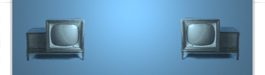
The older, greyer...... dingy old header is below.
Post edit: I've just realised that my headers are now in the centre, so will have to remember to post photos neatly in the middle!
Posted by Johnno at
2:26 pm
![]()

1 Comments:
I like it. I'm actually seeing more of your pages than I did before. Good job. Now if only I could fix mine...
By Anonymous, at 11:32 pm
Post a Comment
<< Home